
Escape technology, find serenity, through colour.
2020’s colour and decor trends are refined and natural and simple
Have you noticed some colours never go out of style, such as black, white, cream and grey, while other colour trends tend to become popular in certain times. The colour trends for 2020 manage to successfully walk the line between contemporary and timeless, ensuring the predicted colour trend palettes have longevity and relevance well into the future giving some certainty that choosing colours from this year’s selection can stand the test of time.
What’s happening in the world around us has huge influence on colour trends. In 2020, there is more focus on the wellness movement continues to gain momentum, as does an emphasis on natural materials.
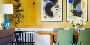
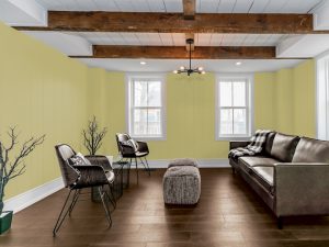
The colours for 2020 are more restrained than before. Pulling back on the bright colours and more influence by Mother Nature. Brown is going to be a strong feature colour in all palettes, golden yellow and terracotta tones for a comforting embrace, tempered by shades from a rawer palette. They appear in smaller doses especially for feature walls and detailing and are often used just as a backdrop for focus furniture pieces. Neutrals are soft and sophisticated, with a gently faded feel that speaks of stillness and calm. Clay, with its warm, earthy appeal, is emerging as a key neutral.
If you are planning to redecorate, re-paint or renovate your home during 2020, these are the colours you should consider painting on your walls, upholstering your furniture in or purchasing soft furnishings like cushions or bed linen.
1. Old Favourites
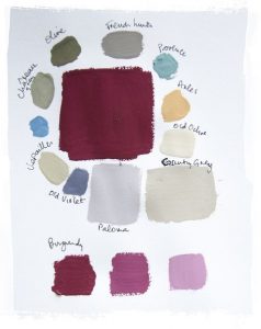
Old Favourites are always popular
The Old Favourites palette is inspired by travel, adventures and escaping away from the chaos of the world. It is focused on bringing the past into a modern palette to reflect individuality with a timeless nod to the classics. The colours in this palette are soft blues, warm burgundy, rust and mustard, and together they create a sense of calm in a room. This palette plays well with period home styling, or homes that combine vintage and antique pieces with the new and contemporary.
2. Nature Within
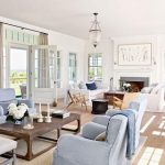
Nature Within aims to bring elements of nature inside, and so creating a serene space. Combing abundant green shades within this palette, paired with chalky blue, plum and earthy tones – these colours are easy to work with and will suit most homes.
It speaks to those who want to harmonise their internal life with nature and the living world outside. This palette is gentle and focuses on organically grown produce as inspiration, with mustard, deep herby green, duck-egg blue and clay colours evoking warmth. I have seen all major paint manufacturers embracing this palette and 2020 looks exciting for renovating.
3. Mother Earth
Curated to reflect craftsmanship, authenticity and understated beauty, the Mother Earth palette focusses on simple and uncomplicated interiors. The palette includes biscuit and caramel shades of neutrals and muted lavender and terracotta. This palette pairs beautifully with gold in small touches.
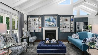
4. New Luxe
This rich and dramatic palette is all about lush and romantic styling. It works well with curvaceous furniture and plush fabrics such as velvet. Not for the faint of heart, this palette boasts colours such as burgundy, eggplant, browns, terracotta and coral.
This palette would work equally well as a lipstick palette. With pinky, red and mauve-based shades that emanate a subtle power, the romantic pinky-peach contrasts with the deep pinky-mauve and the intensity of dark purple and red poppy.
The themes, palettes and specific shades identified as on-trend for the coming year are likely to be seen not only in paints, but also includes furnishings, accessories, homewares and fashion.
The focus is on reflection and re-energising. Soft neutrals combined with bold, invigorating accent hues across all four palettes.
SUGGESTION:
Paint an accent wall in Chinese Porcelain as a perfect backdrop for white to pop. Accentuate the sense of calm with Dulux Grey Marble (DLX1002-4) on the other walls and warm metal accents.
In addition to warm wood stained in Teak, pair Gracious Glow (DLX1116-5) with leather accents and naturally textured elements.
I believe these colour trends may last the test of time as they are easy to live with and neutral with most decors. If you choose furniture wisely, then you are only changing the knick-knacks, soft furnishings and paint within a room to change the colour trend. These earthy tones are certainly inspired for peeling back our time poor lives and reconnecting with home and family.


